Redesign of Case Study Click Here!
Brand & Packaging: RADIA
AUG 22 - DEC 22
Radia is a brand I created for white table lamp that I owned since I was a child. This lamp was first part of my third grade science fair project and has aided in my late-night studies ever since. For a design class project at USF, I decided to take this lamp and create a brand and package for it.
For the brand, I wanted to incorporate two characteristic that I found in the lamp: light/glow (from the fact that it’s a lamp) and playfulness (from the rounded figure and bendable neck). This required finding a balance between elegance and spirit. The name “Radia'‘ came from the word radiant, which describes not just the characteristics of light, but also the lamp and brand.
For the package, I wanted to complement the shape of the lamp, especially when it is bent. I also experimented with form and visibility.
Original Product
Initial Brand Book & Brand Research


Brand Exploration
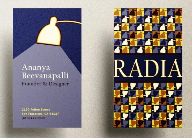
This is one rendition of RADIA business cards. This is a simple and clean version of a business card, especially in the back where the only element is the enlarged and "glowing" brand name. The front simply has the lamp itself create a spotlight on the important information.
This is another rendition of RADIA business card. Though the front is kept the same to keep the focus and legibility on the information, the back is a little more fun and bright to match the brand and character of the lamp. For this design, it's all about the enhancing those exuberant qualities.
This is one of two billboard designs that focus on the product and brand. Here, it's all about having the brand --- particularly the lamp illustration --- radiate in an otherwise dark and dull environment. This is one way to show how even the brand itself can literally brighten one's busy day.
Here is the second of two billboard designs that focus on the product and brand. This particular rendition directs the eyes to the product and it's incredible features. The placement and color choice of the text also aids to the fun and interesting characteristics of this RADIA lamp.
This is another billboard advertising the RADIA table lamp, but it is clearly very different from the first two. Here, the focus is on the story that comes from using the lamp: a night-time study scene where a student's work is radiating with creativity because of the focus the RADIA lamp is bringing. The spotlight is quite literally on the student's work because of the lamp, and every student can experience this with RADIA.
This is the same illustration from one of the billboard renditions. This illustration is very graphic and 2D to keep the accessible and playful ambience of the brand. Still, with the color palette and story, this illustration tells of a winter study night as the lamp creates the perfect spotlight for the student's homework to radiate with creativity.
This is very similar to another design, but this one has the name "RADIA" written across the middle of the billboard. The purpose of this is to experiment how small differences in design can potentially speak a different tone. This design in particular is meant to be identical to one of the business cards, the one where the brand name is also cutting through the middle of the pattern.
More billboard ideas! The pattern really speaks to the fun character of the brand, so here is another iteration of a billboard with only the pattern running from end to end. This pattern seems to work well here, as well as the business card. If this brand is ever built out further, almost all brand extensions will contain this pattern.
Packaging Transformation


