RADIA AUG 22 - DEC 22
Radia is a brand I created for white table lamp that I owned since I was a child. This lamp was first part of my third grade science fair project and has aided in my late-night studies ever since. For a design class project at the University of San Francisco, I decided to take this lamp and create a brand and packaging style for it.
Types of Design
Brand Design
Packaging Design
Marketing/Advertising Design
Tools
Adobe Illustrator
Adobe Photoshop
Prompt
“Choose an object and design a complete branding guide and packaging system for it.”
Original product
As previously mentioned, I decided to choose a study lamp for my project. The particular image taken below has strongly influenced my design decisions, especially when exploring my brand. Not only have I incorporated this photograph, I have also created an 2D vector of it and manipulated that illustration throughout the brand, packaging, and advertisements I created.
brand book
For the brand, I wanted to incorporate two characteristic that I found in the lamp: light/glow (from the fact that it’s a lamp) and playfulness (from the rounded figure and bendable neck). This required finding a balance between elegance and spirit. The name “Radia'‘ came from the word radiant, which describes not just the characteristics of light, but also the lamp and brand.
Brand Exploration: Marketing and advertisments
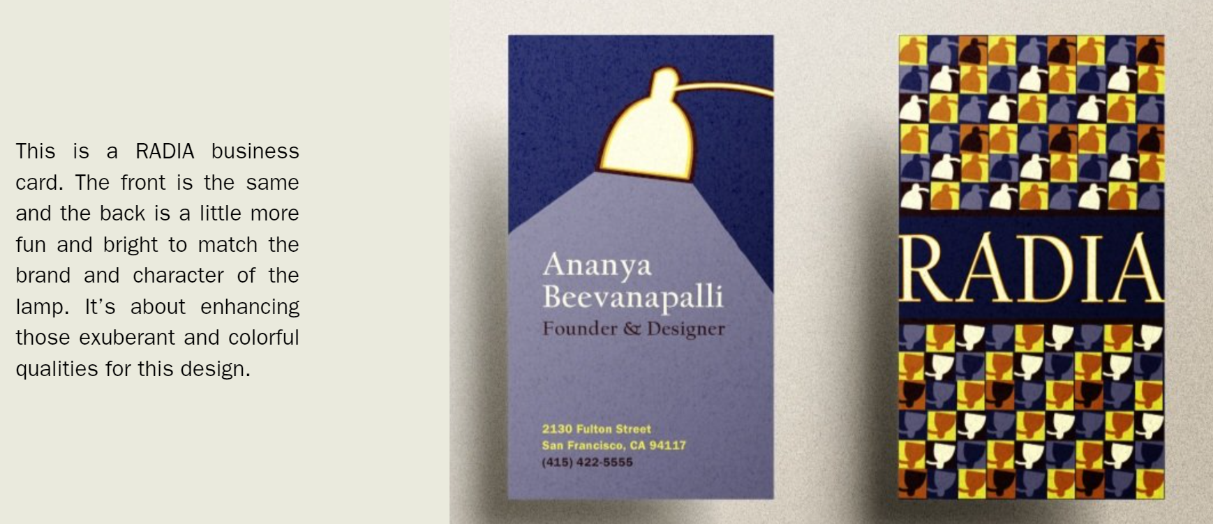
There is more to a brand than simply identifying the guidelines in a brand book; I wanted to test the possibilities of the brand I came up with by designing multiple mockups of advertisements and other marketing tools that RADIA would need in the hypothetical situation of a real brand or company.
The slideshow below presents various design options and experimentation with RADIA business cards and billboard signs.
Packaging transformation
For the package, I wanted to complement the shape of the lamp, especially when it is bent. I also experimented with form and visibility. Following the slideshow of images below, you can see how I began with small-scale and low fidelity illustrations and mock-ups. Once I finalized on the design I wanted to pursue, I began making high-fidelity mock-ups at a larger scare. This helped me figure out details to ensure that the final package can hold the lamp properly. I took my measurements to Adobe Illustrator and began designing how the package would look like. I even included a gloss effect over the light illustrations to enhance that shine. I ensured to include a lot of details and personality into the inside and outside of the package.


Final packaging
The final design for the packaging was professionally printed and folded, resulting in the image below. On the other side of this box, there is an image of the actual product, along with labels pointing out the characteristics and features of the RADIA lamp. This same infographic is visible on the second billboard design. Following the top or spine of the the packaging has the name RADIA written down in the “glowing” format, similar to how the lamp is illustrated in the image below. The interior of the package is filled with the RADIA lamp pattern, similar to the second business card design and the last two billboard designs shown within the Brand Exploration slideshow. Overall, the design for the final package combines the characteristics of the brand and marketing tools, perfecting tying all of my design decisions together into one cohesive project.


