familiar: Marketing AUG 23 - DEC 23
Familiar, which was co-founded by Alice Zhou and Diego Asua in July of 2023, is a startup that provides an app for young adults to deal with their mental health. More specifically, their product is an AI-chatbot app that can be personalized and accessed at any time and any place. A cute character represents the chatbot, making the overall service much more approachable. In terms of what the app does from a technical standpoint, the chatbot grows with the user through interactions and keeps journal entries of previous conversations to track the user's emotional growth. This personalization and journaling feature, along with an integration of gamification, makes Familiar engaging for customers and encourages them to interact more with the app.
Role: Social Media Marketing Design Intern
Types of Design
Social Media Marketing Design
Illustrations
Tools
Adobe Illustrator
Canva
Purpose of internship
As a Social Media Marketing Design Intern, my goal was to bring the attention of potential users to the company through Instagram. However, since Familiar is a new company, there is no money to invest in, so I had to depend on natural means of advertising.
“I must increase brand awareness and bring in as many users and customers as possible. The more people know about Familiar on Instagram, the more app downloads Familiar will see.”
brand guidelines
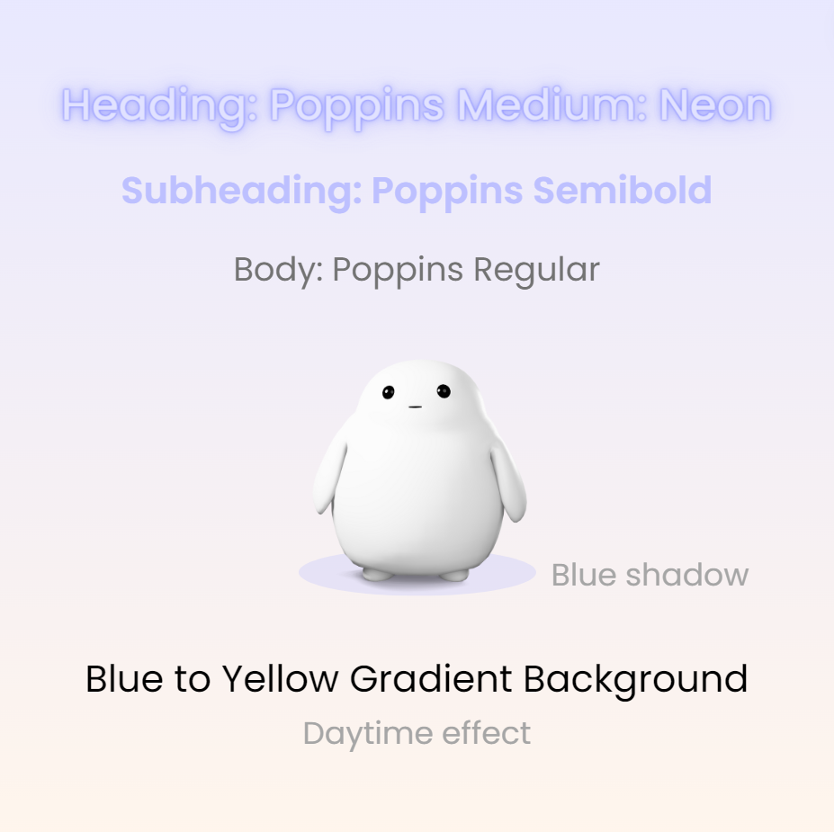
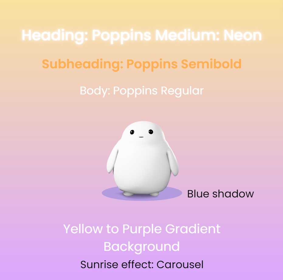
To make my designs consistent and easy to replicate, I decided that creating a “brand book” of templates will be useful —- and it was. With a strong influence from the visual identity used for the app and company website, I came up with the following. The background would have light-colored gradients that mimic the sky. So, there are variations of daytime, sunrise, sunset, and nighttime. The heading would match the top color of the gradient and have a glowing affect. If the background uses deeper colors, the heading would glow in white to stand out. The sub-heading would always be a deeper version of the top color of the gradient and the body type would either be a dark grey or white, depending on the deepness of the background. All of the visuals will incorporate the same 3D and bubbly features of the Familiar pet. Body type would be written on speech bubbles and 3D emojis would be placed depending on the type of post. With this brand guideline, there is a clear visual identity that directly relates to the Familiar’s app and company website.


First set of posts
The first round of posts followed the visual branding described above. For these posts, I followed the templates very closely. Other than the content itself, my changes included minor placement and visuals to ensure the designs looked even and centered. However, since these were the very first set of posts for the Instagram, there was also a level of experimentation with how we wanted to present the information. For example, the Managing Stress in a Busy Life post looks exactly like the template, while the Self-Care Check-In post does not use a speech bubble for the body type. Through this slight experimentation, along with research on how competitors formatted their posts, we analyzed the viewership count and recognized which visuals were well-received by our followers.
recognizing the need to pivot
Since the company has no choice but to depend on natural viewership and followership, the posts must be attractive and meeting industry standards to gain any traction. As a result, the visual branding of the company’s social media had to change.
“Familiar’s clean, simplistic, and 3D brand is not enough to capture the attention of the target users on Instagram. Familiar’s competitors incorporate detailed and fun 2D illustrations with vibrant colors.
Rebranding
This new brand —- which will only be used for Familiar’s Instagram or any other marketing forms —- turns the original color palette vibrant and the 3D visuals into 2D. The white text glowing on deep colors proved to look more engaging and visually appealing compared to the colored text on light colors. Also, with more holidays coming up, there was a new need to create unique, themed visuals (versus following a set of templates) to appeal to our followers. With this new brand identity created, I made a brand guide with reusable or editable illustrations of the Familiar pet and icons of various emotions for specific posts.


Second set of posts
After redesigning the visual branding, we decided to brighten the gradients, incorporate more colors, and create more detailed 2D illustrations. Especially for the holiday-related posts, I illustrated some of the main elements in Adobe Illustrator before moving all of the assets into Canva and finalizing the designs. With these set of posts, there is a clear connection in terms of visual identity and patterns; however each post is still very unique to the content unlike the first step of posts. With the visuals matching the theme versus following templates, the viewership and followership of Familia’s Instagram actually increased as they were more interested and engaged with the variety of posts they were seeing. The new designs are also more fun, bright, detailed, and some even animated, which also feeds into the company’s goal of improving mental health and creating a supportive and fun experience.
Please go to https://www.instagram.com/heyfamiliar to view all of Familiar’s posts, reels, and advertisements. I designed most of them.
a closer look into the process
Since each design is more unique, I ended up making various design options for each post. For example, while the Trick or Treat! post features the Familiar pet in a cat costume, I also made the same character wear a pumpkin costume, a ghost costume, and a simplified cat costume with only the ears and tail. There was also a variation for the title, as some designs said Happy Halloween! or Boo!. Similarly, for all of the following posts, there were many variations on visuals, colors, and heading before the anything was selected or finalized. There were even some designs for posts that never got published, which is why I cannot show them. By making all of these versions, I provided my supervisor with the ability to visualize multiple possibilities and choose which features of which designs she liked best. From here, I put together her feedback with my own ideas to create the final posts you see above.
—- Halloween Post —-


—- Holidays Post —-


Results
Note that I began working for Familiar only 1 month after it was founded, and I had to depend solely on natural viewership. The increase in followership and viewership, along with the number of impressions, created enough momentum for Familiar to accomplish its marketing goals.
“Familiar gained a new brand for its marketing, which allowed it to increase its followership from 0 to 17 in 3 months. This also led to over 100 impressions on the link to download the app.”

